

WORKSHOPS
Offering everything from AR to a pregnancy suit, I managed to experience many different workshops this unit to help me explore user-centred design. To check out all of the workshops I was involved in during this project, click here!
INTERIOR ARCHITECTURE MAKER STRAND
This project I got the opportunity to work with the students on Interior Architecture Design for our commission by Activate. All our meetings, discussions and collaborations have been documented so, check it out here!
RESEARCH
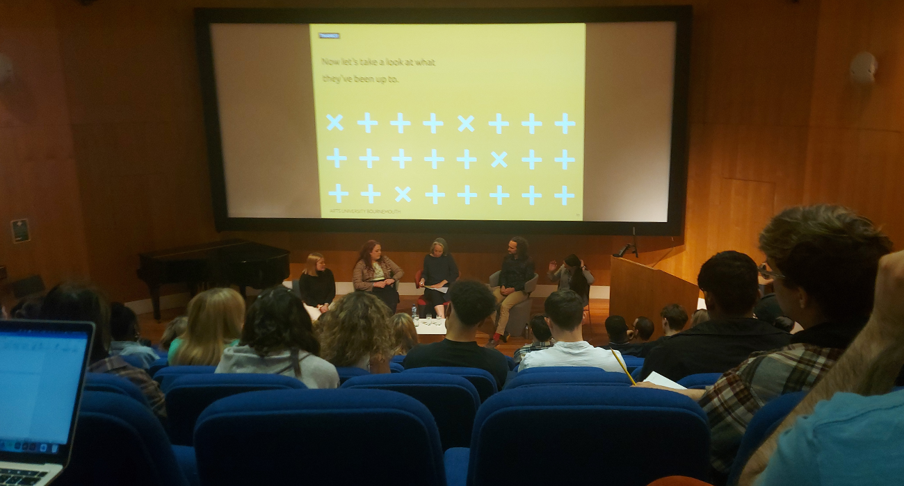
AUB Human Symposium:
Spread over 2 days with a hybrid blend of online and in-person talks, the AUB Human Symposium was a great experience that expressed many issues we have with our planet relating mainly to climate change and pollution. The symposium allowed guest speakers from a wide range of disciplines to express research and solutions they have come up with to help battle the current climate crisis.
To see my evaluation and ideas about the symposium, click here!
OUR TIME ON EARTH EXHIBITION:
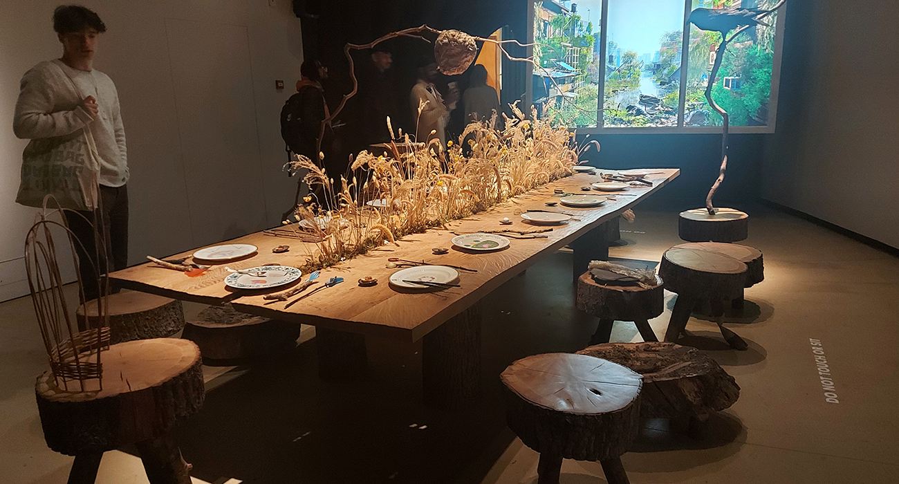
Hosted by the Barbican, Our Time on Earth was an immersive exhibition about our planet and the ecosystems that we live within. The whole exhibition explored extreme ideas about the world we live in and how we can combine nature and technology.
The initial room presented a wooden table with utensils that looked almost aboriginal but were made with twigs and recycled computer parts. This highlighted the blend between the natural world and computer waste which could be a possibility if we do not address our climate emergency.
In the following room, was an exhibit of an imaginary seaside resort and the amount of pollution that it creates via topological visuals throughout the day. visualising something like this is a great way to understand how much pollution an area is creating and what specifically can be targeted and reduced.
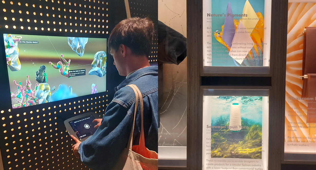
After witnessing site-specific data, I explored an interactive section where the user stood in front of the screen and was transformed into a body made of flowers, leaves, pollen, and other natural matters. This was a great way to get people to understand the form of some of these natural elements and combining it with an interactive element engaged me fully.
Once I had a little dance in front of the screen, I moved on to see some specific case studies on how our natural world has been moulded into new materials and resources utilised in everyday life within rural and urban areas. examples like mushroom leather, seaweed thread and a north face shirt with nutritional facts on it based on the materials used to construct it.
Following the trail through the exhibition, I stumbled upon an interactive game where the player was to find multiple different elements within our ecosystem and try to balance them by collecting equal quantities of such. this game reiterated to me that overwhelming our ecosystem with one too many elements such as humans or incorrect nutrition, will not allow the system to survive and die.
Towards the end of the first section of this exhibit, was a multi-screen display with stunning visuals showing how pollution has taken over counties and cities like London. the aesthetic technicolour display reminded me of some similar techniques we used within the coding workshops and was very inspiring to me on an aesthetic level. Due to it catching my eye I was fully engaged with the message shown about using technology and data recording to our advantage on fighting this climate war.
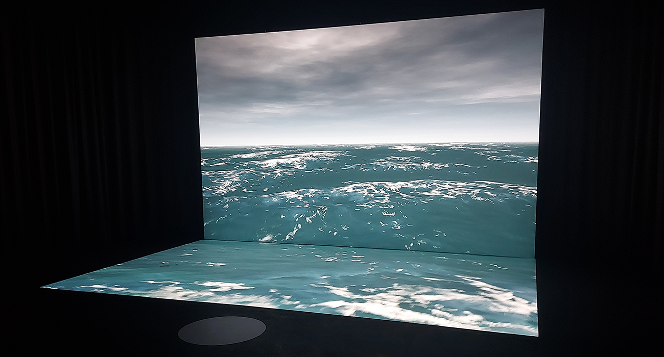
The final part of the exhibition that we got to experience was a full body analysis hosted in a basement room. when a participant stood underneath the sensor and in front of the ocean screen, the viewers would dive deep underneath the ocean shown and would show the development of what we once were – plankton. This piece was fully sensory and was about the visuals and audio for the viewer to experience were imitated going under the sea and growing outwards.
Overall, I found this exhibit to be truly inspiring and informative about the natural world we live in and the fact there are solutions out there and some of these incredible designers have already come up with some amazing innovations to help tackle the climate crisis. understanding that there is not one solution, but many is a great starting point for my project and should help inform my research when taking into consideration my target user.
USER RESEARCH:
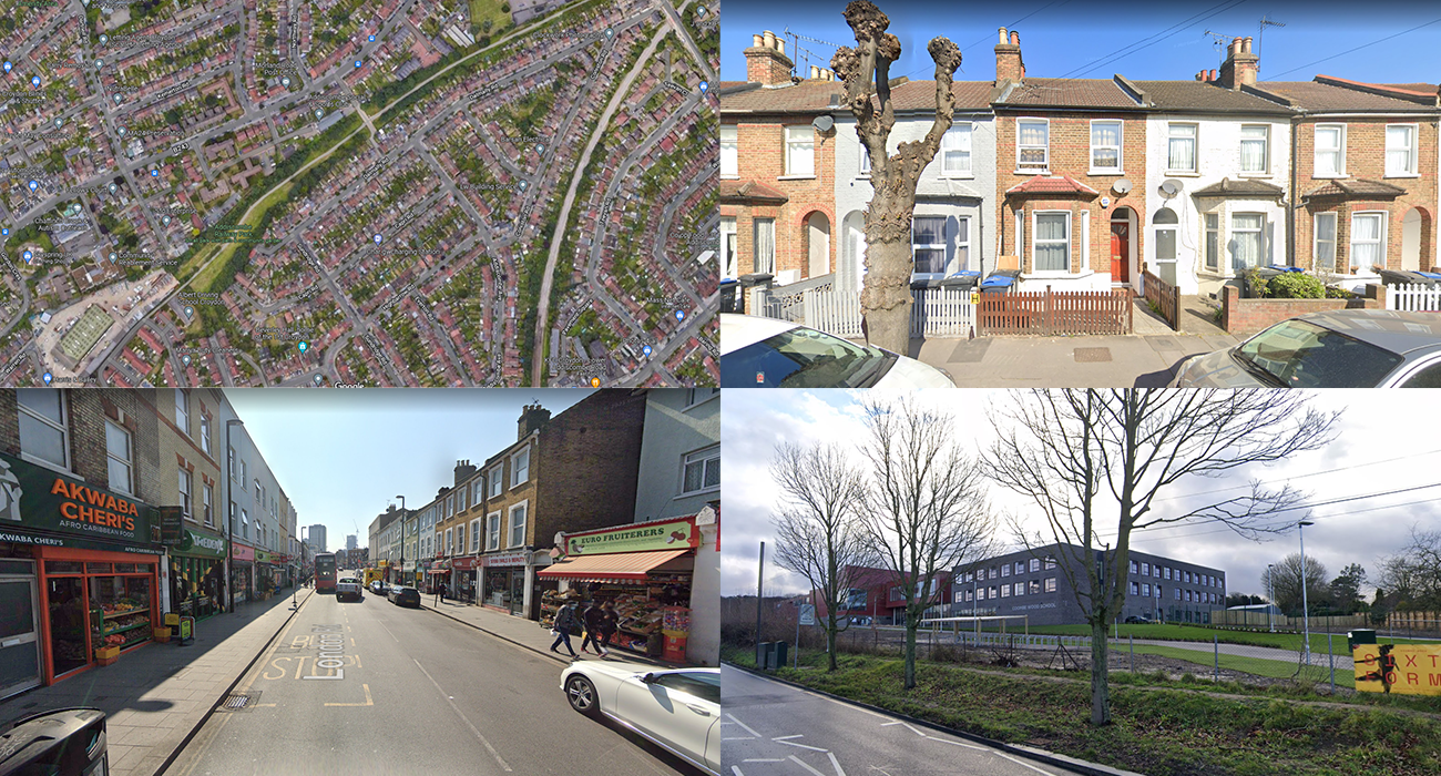
For our user, we wanted to target a user that was not directly near big spaces and wanted the challenge of persuading them out of the house. When thinking of places, the outskirts of London came to mind as there are not a lot of large green spaces available and is a very urban area. We placed our user in Croydon, south London which had a few small green spaces locally but nothing substantial.
The income was another factor that we had to consider about our user as that would determine how much access he had to specific places. We wanted the user to use their own initiative, and such did not want to give them a high household or personal income, where most of the money would go straight to paying a mortgage and then paying bills.
The lifestyle we wanted our user to have is a cruising attitude to life, where he would turn up their job/school and do the work but not put in the effort to go the extra mile. They do the bare minimum and then will spend most of their free time distracted by something else which could be meaningless or another hobby we could integrate with our idea. The main takeaway we got from this field was a school student where they go to school and then go home and plays games all evening.
USER PERSONA:
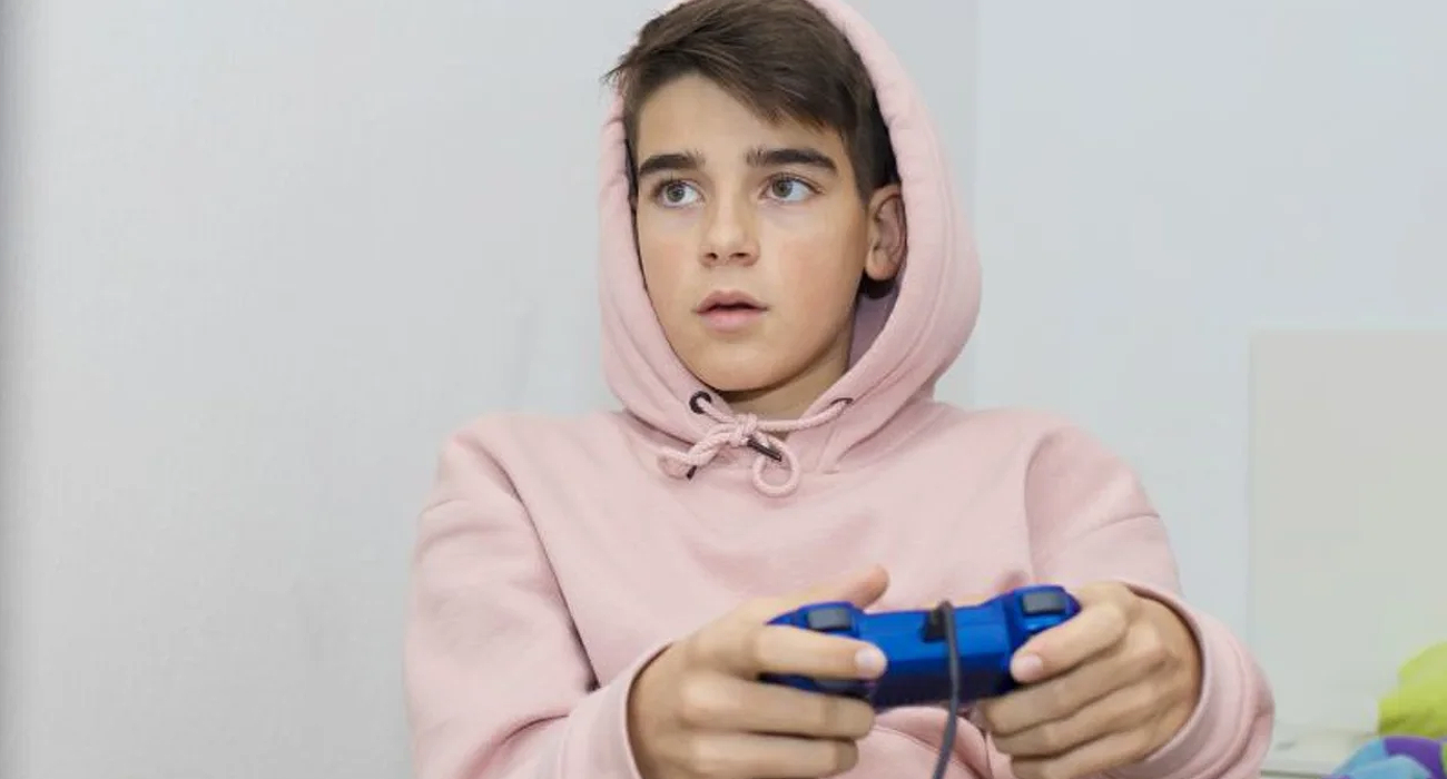
Our chosen user is Brian. He is a 15-year-old student living in Croydon, South London. He is an only child who loves to game on his Xbox and rarely leaves the house unless it is for school or to meet the few friends he has. We wanted to create a user that we would need to figure out how to make them leave the house, and what incentivises him out. His life is rather basic where he goes to school on weekdays for most of the day and the evenings are spent just playing online with his friends. On weekends he has even more time to game, where playing online takes up the time where he would be at school.
His parents were another key factor in designing for Brian as they have a lot of household influence. Brian himself does not work or drive and is limited to what his parents can provide for him. The household sustainability is also heavily dependent on his parents as they are the ones who have power over the purchasing habits of the house and would generally have the need to recycle and sign up for green energy companies.
The household income worked out to be roughly £45,000, where the father, Dan, is a full-time electrical engineer who brings the bulk of the income to the house that being £30,000 and the mother, Liz, is a part-time Marks and Spencer’s manager bringing the remaining £15,000 to the house. Brian’s income is dependent on pocket money where he gets roughly £20-£30 a month for his outings, travels and afterschool activities.
MARKET RESEARCH:
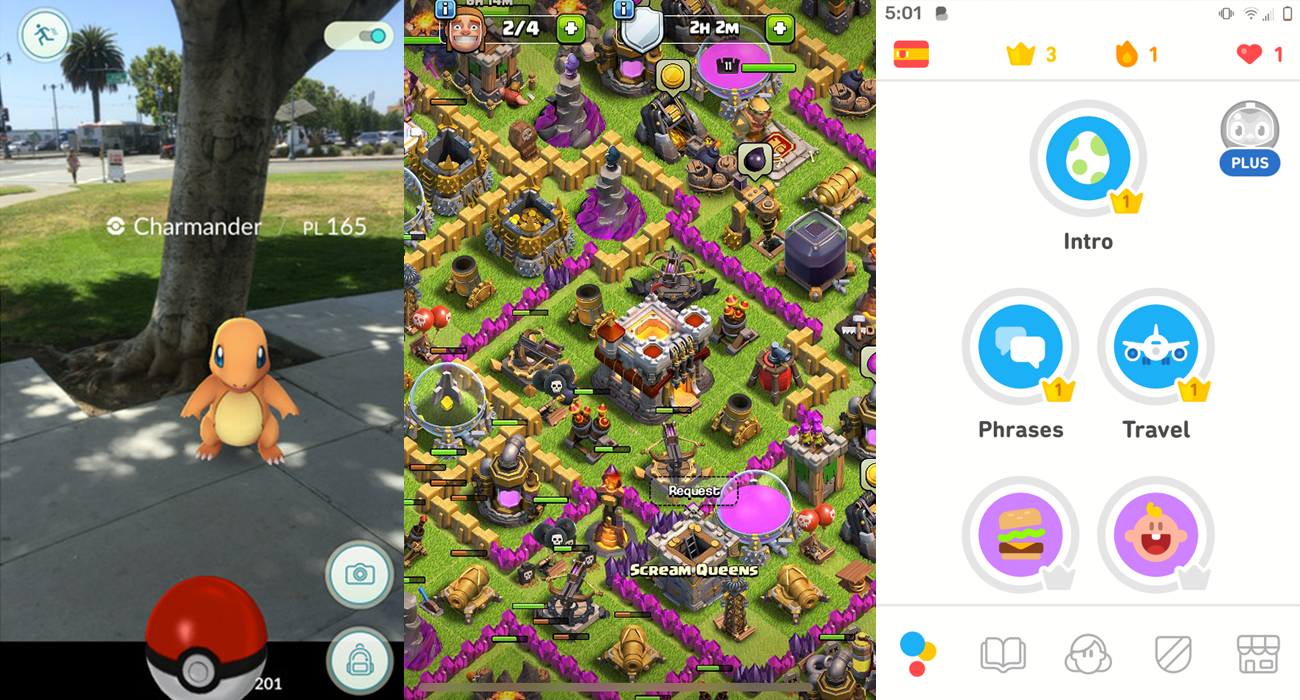
Some of the key research elements are within the mobile game market. We really liked the aesthetics of mobile games and the tactics they use to entice users back repeatedly and would appeal to a 15-year-old gamer living in an urban environment.
One of the games we looked at was Pokémon Go as that was a huge hit with the younger market on release and managed to get a lot of users out of the house just by placing your character in the Pokémon world. The game used a combination of geo-location to indicate nearby Pokémon and then the player would use AR to try and catch the Pokémon. The game made people travel around their local area (and even benefitted from travelling further) to collect and catch these Pokémon and such the players were sub-consciously exercising and having fun by collecting digital items.
Another game we investigated was Clash of Clans. This game interested us due to its base building aspect where, again mainly teens, players would create a base and compete with friends to see who had the better base. The idea of having something larger scale to show-for interested us and could be used as a gateway to introduce a social element into our idea.
Finally, we looked at the language learning app Duolingo. Contrasting to the fun battling mobile games, Duolingo was under our eye due to its gamified learning qualities. The app made learning a new language fun where you were challenged to uphold a streak, bet gems to see if you could keep the streak and be rewarded for going over lessons that you have already completed. Like Pokémon Go, this app also was a great vice in enticing the users to come back repeatedly and if we manipulated this idea and gamified qualities, we could entice our users out into greenspaces regularly and keep them an ambassador for these areas.
PROCESS
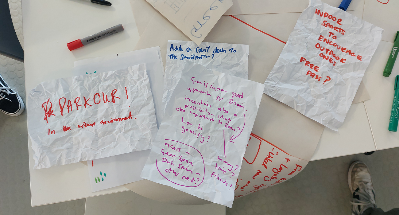
DESIGN JAM:
Hosted by Marten, the design jam was a quick and snappy event to lay out the foundations of our brief from our users to a basic idea.
After a simple briefing on what a design jam/charette is, we started by identifying our target user and end user. Our end user is “Brian” who is a 15-year-old student living in Croydon, London in a block of flats surrounded by concrete – where our target user would be someone like George Eustice the Secretary of environmental affairs, who is likely to have a large private estate and a lot of power and influence over policy change about land access and maintaining interest in environmental benefits.
After our users were defined, we decided to specifically design for Brian, due to this being the likely candidate to participate in the Dark Skies Green Space event. The first stage of ideation was a lightning round where any idea was valid, no matter how wacky they are if they fit within the intervention wheel.
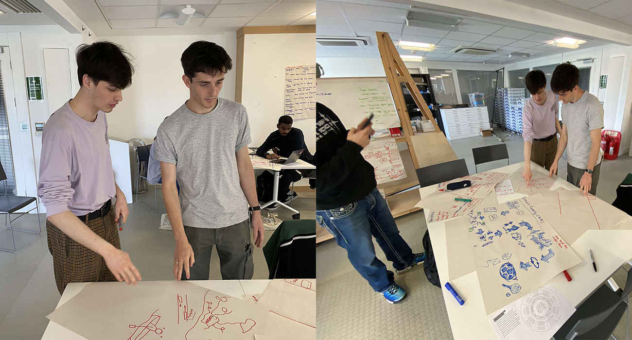
The second phase of the design jam was combining these initial, loose ideas into something more tangible. We combined the idea of a free travel pass and a gamified app to incentivise Brian, who sits at home on his Xbox for most of the day, to go explore new places and get rewarded for doing so. Another idea we had was to utilise canal systems and create almost a cruise like experience where patrons can explore the country, canal-side, and travel from urban areas like London to natural greenspaces.
In conclusion, the entire design jam was a massive success for the team and me, due to it further refining our users and giving us potential ideas to follow when designing with the intent to make Brian a future ambassador for green spaces.
INITIAL IDEA:
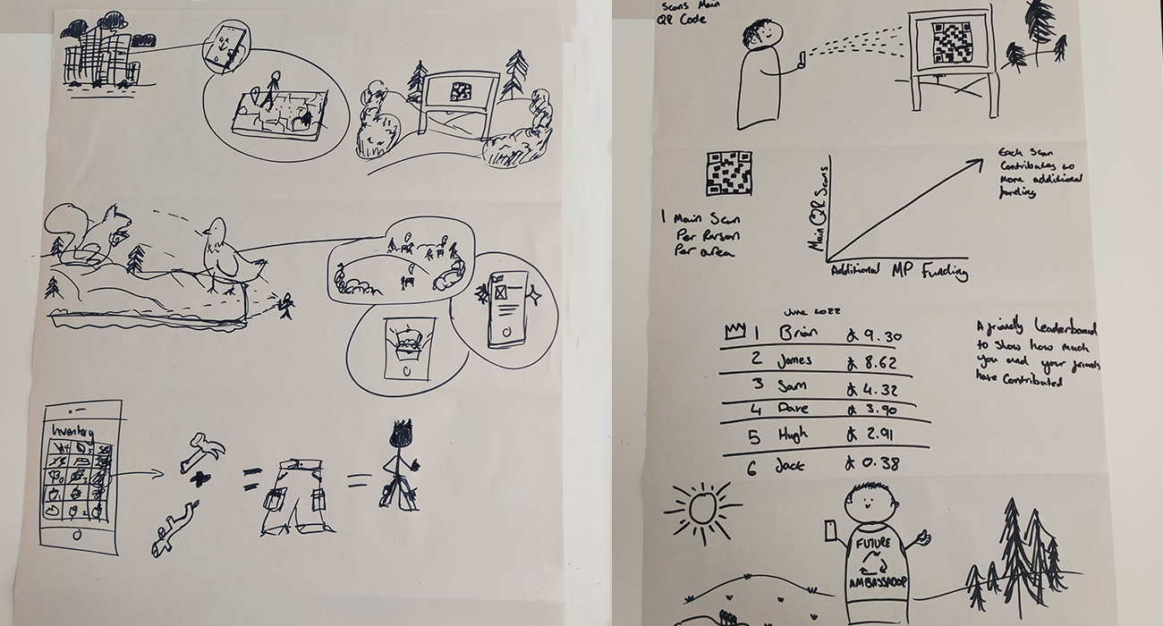
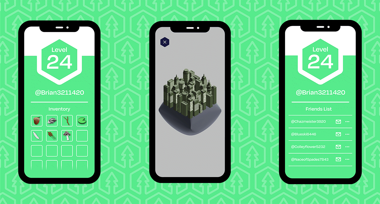
Our idea was a gamified exploration app where the user: is to sign up to the game, encouraged to travel to a nearby green space, find the large QR code in the centre of the park, scan this to reveal a quick analysis of the area and use the AR filters to indicate where to explore next, travel to the areas where he was suggested, and explore this new area of the green space to find a hidden smaller QR code which will grant him materials in-game for making cosmetic items for his character to boast to his friends about. By having him start in the middle of the park and pushing him out to different areas, it allows us to help him explore sections he may be unaware of or experience different mini environments of his greenspace such as a wooded area, a pond or even a flower patch in his local park. These sub biomes will grant specific items to the user unique to that type, enticing them to explore more of that variety and have a want to keep coming back and experiencing new greenspaces.
We felt this idea would be a great match for Brian as this is a gamified exploration app that would get him out of the house without knowing he is getting exercise. There are elements to help a friend group get out together where the rewards are doubled if you are partied up.
INTERIM-CRITIQUE:
The interim critique was a great indicator of how developed our user and idea is at the current state.
Having Brian and his parents fully thought out, we got well-received feedback on how we have constructed a user and the background of his fabricated life. The biggest criticism we had about our user was to source some better images to represent them. The dad had a very real looking face (almost straight from Facebook) but Brian’s was too stock image-like. For our next critique and development, we aim to change the image to express what Brian is like more in situation i.e him playing games on the sofa.
Our visual language was related to Pokémon Go and the way they entice fans to explore the works within the fake ideas of Pokémon. Our fellow designer Ness gave a very interesting insight stating she made “new friends she never thought she would” from playing this game in random locations. This could be a very beneficial way we can make Brian more engaged on a social level. Along with engaging him with a group of friends, we need to figure out what distinguishes our app from Pokémon go and what is our unique selling point.
3D ASSETS AND MOCK-UP DESIGN:
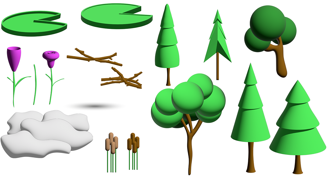
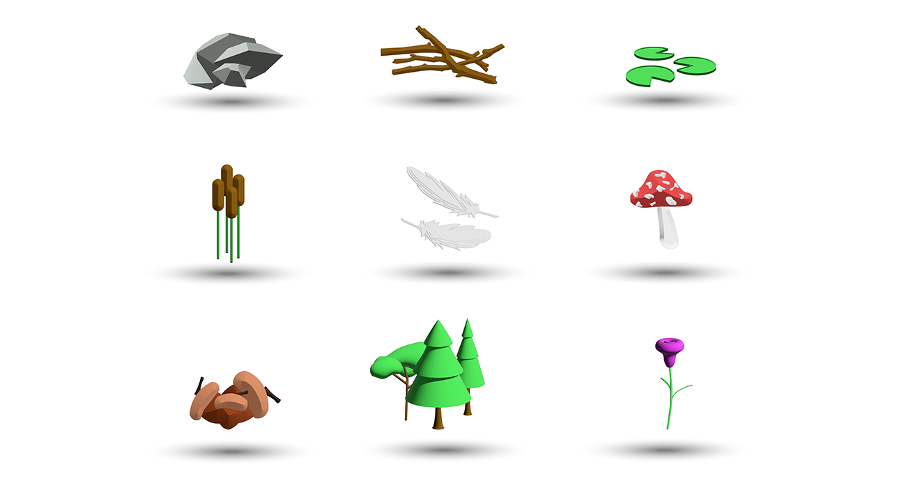
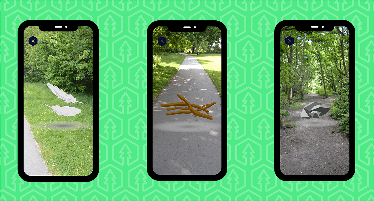
Once we had our concept down, we got to designing each element within our group where I was tasked with creating some 3D items for the game and mock-up some situation images on how the user may find them out in public. I used Illustrator’s 3D effect to create these items as we wanted very simple, low-poly style designs which were ideal for our target audience. To create the items, I created a basic flat shape and then used a bevel to give it an angled 3D effect. This worked best on the rocks and twigs, but I felt the others did not achieve the same effect.
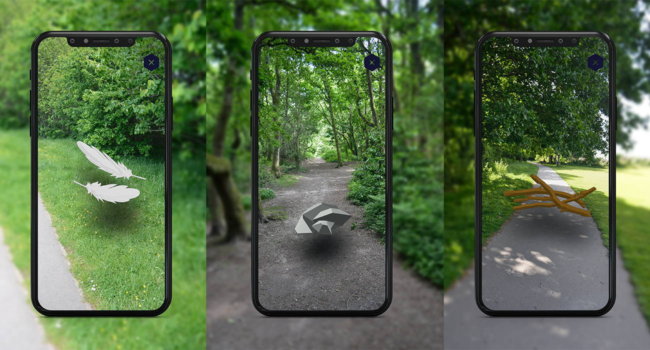
Once I had a few items crafted, I went to my local greenspace to take some images that may relate to a similar situation in south London – paved walks and small wooded areas. I took images to imitate the AR aspect of the game and thought of the positioning whilst I was out on how the items would appear. I intentionally took images that broke conventional photography compositional rules to make it feel more humanised for the user and imitate the feeling of looking around and searching through the lens of a camera.
Once I had the images, I used some given UI elements from my group and the 3D items and started to compose a wild encounter. I started with the feathers where the item would appear off to the side of the main path and be floating above the ground and not too larger to be blocking the user’s screen. I repeated this process for more items and then we had our gameplay display on how the items would be collected in-game.
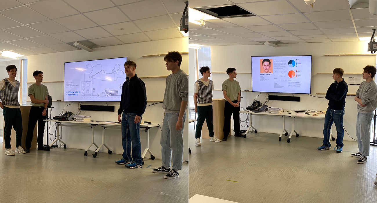
CLIENT PRESENTATION:
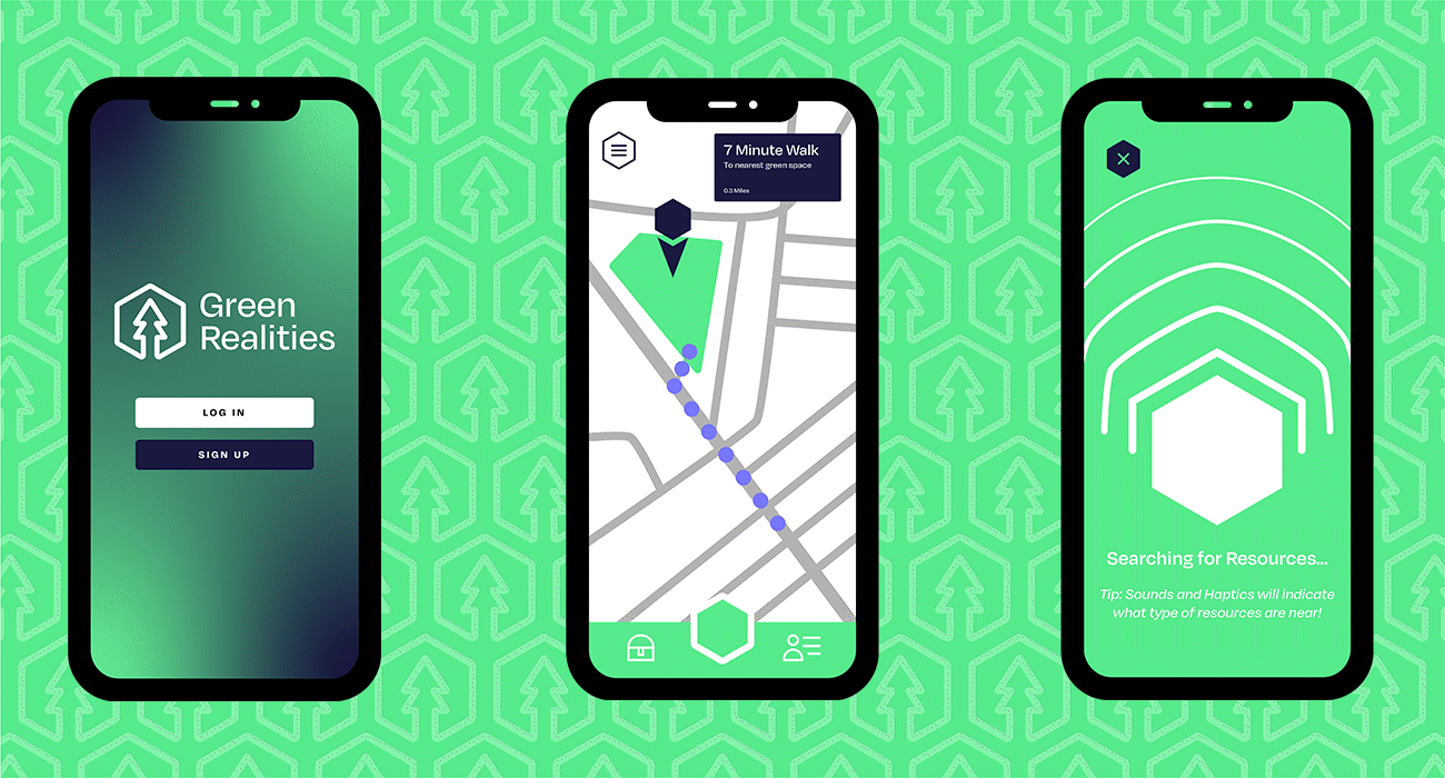
Our refined concept for the project was a gamified app, to help entice our users out of the house, collect items and build up a green city. The app will use AR and geolocation to incentivise Brian to explore the area around him, and he gains items that work towards a larger element that he can promote to his friends.
Initially, you will sign up for the game and start with a cityscape. The app then will show you your nearest green spaces, and once you get there your game will bring up a haptic feedback compass to try and get people exploring the area to find rewards. The compass will be vibration-based so there is no need to be looking at the phone whilst walking around. Once the compass is giving a lot of feedback, an AR interaction would come up where the player is presented with a reward that occurs nearby, and there can be additional resources that the user can gain by walking around and would occur at random timed intervals. Once the user has got a certain number of resources, he can craft items for his cityscape to expand and make it greener. There is a leader board section to compare the cities to your friends and we proposed a gameplay element that would allow users to battle each other but that is just in the ideation stages.
The clients liked the idea we had explained to them. They mentioned that it was “very appealing” to a 15-year-old and the gamified ways of getting them out of the house has been proven highly successful in previous cases and such would most likely be so in our case too. The criticism they gave about the mock-up posters we showed was it was heavily leaning into an advert style and did not give the right language for a 15-year-old. After the presentation, we then started to reconsider a more appropriate poster and touch up on the idea’s final stages.
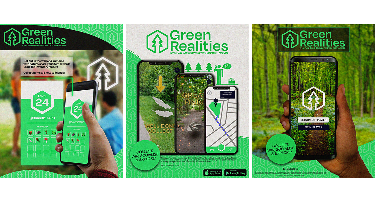
INITIAL POSTER:
Our initial poster style was created by Charlie and represented our idea in an advert style. The posters showed the app in use with text describing what is happening and ways to download the app. Some feedback we got from the client was that the posters were “too corporate” and “didn’t communicate the right language to the user”. We felt this feedback was valid and the designs would be used as good advertisement for the app however that was not the intention of the posters.
The next steps were to come up with a design that followed the insights we gained from exploring our chosen user and to create a poster to target their needs. The poster could be a simple element that was taken from our bigger idea.
POSTER DESIGN:
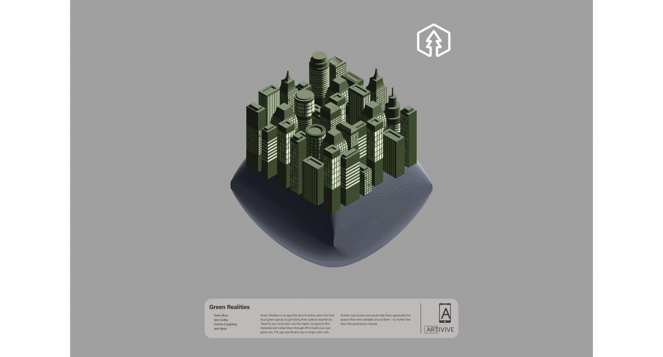
Our initial idea for the poster was to have our cityscape that we designed in-app as the centre composition. I designed some simple colour ways using the city that Jack designed with greys and browns as the background. The idea was to then grow the city throughout AR where plants would pop up within the city over the time the animation is playing.
To help visualise the idea, I created a very simple animation to show to our peers and tutors how the design would play out. The animation consisted of the poster background growing over the boarders and the text boxes fading away. The floating island with the city on top would then centre on the poster and then a small opacity animation would happen where the city would turn greener, the background would turn from grey to blue and the city would slowly appear with plants mixed in.
After deliberating with the tutors, I made some changes to the visuals of the poster. We changed the mound that the city was sat on from an inflated object to a bisect of the Earth, which was more relevant to the project to truly emphasise the fact that this is a city section. The text we wrote describing the project needed some adaptation, where the exhibition poster talked about the conceptual project we created, however we wanted it to describe the issues and solutions our idea targets. The final adaptation we made to our poster was to have the city floating on white, this is to have a high contrast image for the viewers to see clearly and get curious about so the animation expresses more than the print-based counterpart.
For the AR part of the poster, as mentioned prior we wanted to have the city grow, expand and become so much more vibrant. We achieved this by creating a finalised Illustrator file with what we want the outcome to look like and then used After Effects to animate each item, per layer. The process was time consuming however was very flexible if we wanted to add/remove plants and buildings. Once we had the main city animated, we then moved onto creating elements that would move out of the frame and into the space of the viewer. These are elements like clouds and vines that would break the boarders of the poster and grow/move outwards.
If you want to see it come to life in your own space, click here to see a full sized photo and scan the poster with the ArtVive app.
OUTCOME
As the outcomes of the project, we have created an engaging app idea to help Brian interact with greenspaces and hopefully feel compelled to interact with the space around him in time to come. Along with the gamified exploration and expansion game, we have designed an interactive poster to be presented at Green Space Dark Skies where the viewers can use their phones, or on-site iPads, to scan our poster and watch it come to life – from a polluted city to a thriving luscious habitat. Have a look below at the visuals we have created.
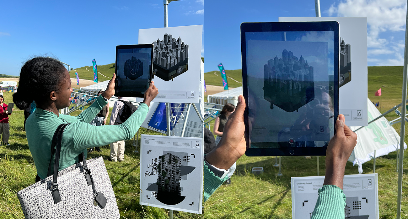
EVENT FEEDBACK:
During the Green Space Dark skies event, we got extremely positive feedback on our poster from the attendants of the event. The positioning and ease of interacting with our poster allowed more users to engage with the concept and such said they loved “the depth of the poster” and that it “came off the template rather than staying in the middle”.
The animation coming out of the bounds of the poster, I feel, really allowed the concept of growth and expansion to be expressed as we wanted to truly show how the plants can be exciting and gamified in the eyes of our user. Having people who wasn’t our target user interact with our poster and have good feedback upon it was a good sign that the idea would be accessible to more than we intended and could become a tangible thing later down the line.
EVALUATION
This unconventionally graphic design brief has been an extremely entertaining project as it stemmed away from branding and focused highly on the user centred design which I found I enjoyed a lot more this project. Creating a user that is not directly related to myself and designing for their needs was an experience that I have only done once and felt that I greatly improved my skills into researching a user and finding out their issues and how to address them. I felt that our user, Brian, was a great representation of a teen in an urban area with low income, little access to green spaces and minimal motivation to explore green spaces around them. I feel that our designs as a group targeted the user directly to their interests and would have an impact if we had more time to user test it.
Post-project I wish to: play around with more items in-game to see what would fit our user best as feathers and flowers may not appeal to them, test our designs and creations on a user that fit the majority of the attributes we’ve given our fictional user to cross-reference our research insights and see if they’d actually be interested, consider an element to the game/app that would react and add benefits to current weather and time conditions (like rain or night time) to help encourage the user out the house even in not-ideal conditions, and I hope to one day actually create this app by learning to code apps and potentially try some market testing of this game would actually work however this is potentially a summer project to do in my own down time.
WEBSITE INFLUENCE
The idea of growth and expansion has had an influence when designing my website and project exploration page. After the coding natural forms workshop, I found other examples where nature has influenced the digital world such as the game of life. To highlight my discoveries, and have some playful elements on my website, I decided to include the game of life as my index page with a personalised touch. The code was sourced from p5 and was originally open source, I then manipulated the colour scheme to match my site’s colours and then tried implementing it as the background. Following the same steps I used to implements the randomised trees on my workshops page, I found there was some issues instantly. The issue was with the script wasn’t showing in the centre of the body, where I had targeted the script to be. The issue was solved by creating a singular column grid on the index page and centre aligning it, however the size of the script wasn’t fitting to the screen. To accommodate this, the script needed an element that worked out the window size and then formulated this into an integer as you can’t have a fraction of a pixel. This then fitted the game of life to the whole screen and would run upon start up.