

INTERIOR ARCHITECTURE COLLABORATION
Our initial meeting with the Interior Architecture Design students was very insightful to our project. The designer I met on their course, Amz, enlightened me about her project to help create a greenhouse space which would encourage flora and bees housing. Understanding the materials, size, colours, message and style of her design would help our design group in graphics create a cohesive piece that tackles the same issue and ultimately engages with the viewer on a deeper level, triggering a call to action. Her insight and bigger scale perspective allowed us to add a unique digital/print blend to the physically constructed object she has conceptualised.
After meeting with Amz and talking about her direction and approach to the Green Space Darker Skies project has allowed my group and I to theorise on unique outcomes, perspectives and statements to tackle when designing for our brief and the clients.
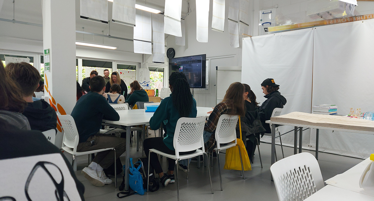
IAD MEETING 2
Following the large meeting between graphics and interior architecture students, we met again in the innovation hall to help acknowledge some key aspects of this collaboration. What we wanted to achieve was an understanding of the posters and themes that will be presented from both courses.
One of the first pieces of information that we got from the interior architect students was the poster size and formatting of the poster, where we would design an A1 poster to fit on one of their pylons and would need a roughly 5-centimetre border to accommodate any fixings the interior architecture students will need to use to attach our poster to the pylons.
After understanding the poster sizing and formatting we talked about some of the themes that the exhibition will be divided up into those being: technology, trees, sea, and animals/bugs. the pylons would be divided into four corners and presented each of these themes on a corner each accordingly. As we started to explore our brief, we would find out what category of these our posters would fall into.
IAD MEETING 3
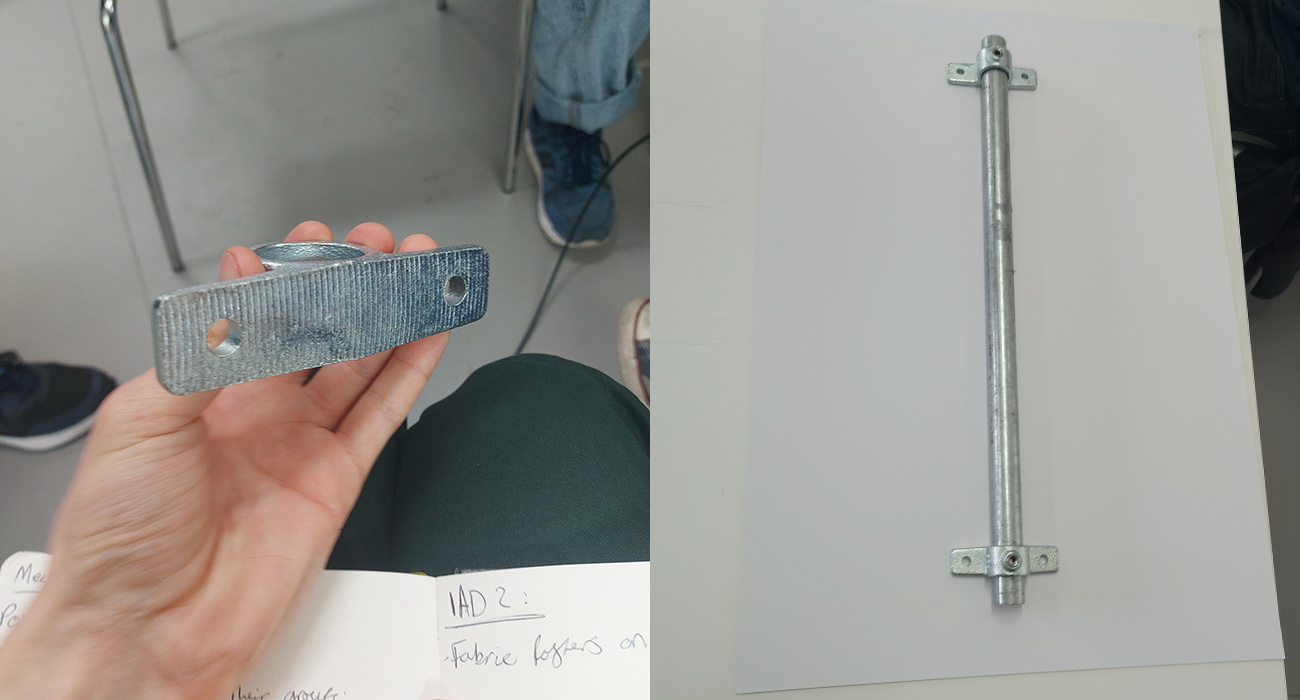
The all-day collaboration with the IAD students was to problem solve and create tests for the site exhibition. The start of the workshop was discussing and ideating for designing the posters and where they would fit within the pylons. we talked about different materials we could for the posters such as: paper, card, wood and a fabric that is made from recycled plastic bottles. After finalising that there would be 20 posters overall, we worked out that there could be 4 graphics posters per corner of the pylon, allowing the remaining 4 IAD posters to take up the central space of the pylons.
Once the distribution was allocated, we moved on to troubleshooting the mounting of the graphics posters. Initially we were under the impression that there would be a clamping mechanism on the top of the poster to hold it in place, however we discovered the likelihood is we would have 2 mounts per poster attached to the pole. This way of mounting posters meant that we were unable to use the fabric as it would have no support or structure when standing in the pylon. This ultimately led us to decide we would use A1 wooden backing on a paper/card-based poster with 2 mounts, one at the top and bottom of the poster.
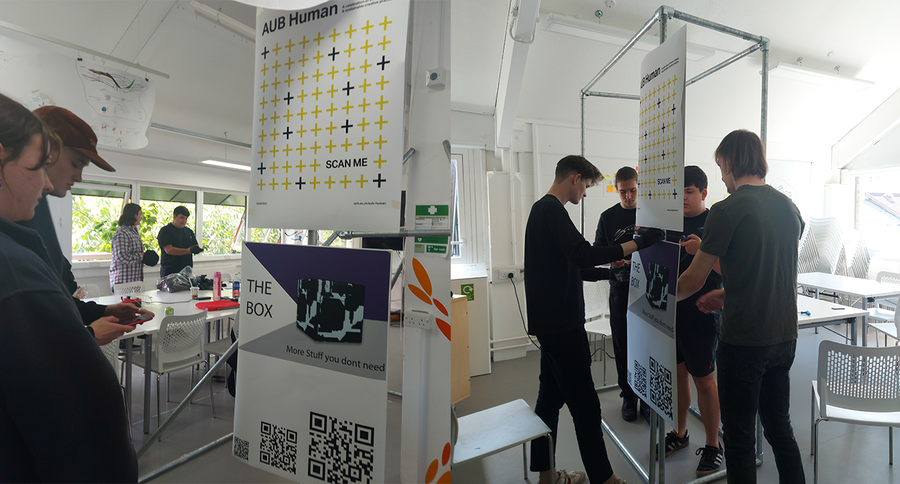
Narrowing down on the ambiguity of our exhibition, we then tackled some more issues and speculations we had with the sizing of the QR codes. Utilising the large A1 printer within the graphics department, we printed out a copy of the AUB Human front cover, a copy of my Zappworks workshop final piece and a page with varying type. The reason for these items specifically was so we could test out the different types of AR that would be used on site, those being ArtVive and Zappworks. When blown up to A1, the posters worked perfectly from close and from a distance we felt no one would go beyond at the site. This was a very positive outcome and gave us reassurance that the AR aspect of the event would not be ruined by scale.
The final part of our day was testing positioning and layouts of the posters in situation. The posters were A1 and stacked upon one another however we played around with spacing them more between each other and with different angles for viewing. Once we accommodated for the lower posters being too low to view and the higher posters being just out of reach, we agreed on the position and noted it to be replicated on site.
Overall, this day was incredibly beneficial for sorting out the poster’s dimensions, templates and positioning for the exhibition. I had a lot of fun experimenting with AR again and physically constructing something that would be held at the site.