

RESEARCH
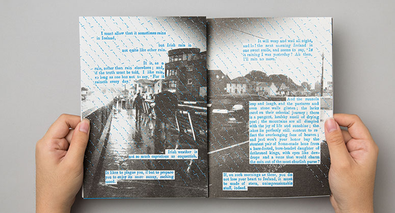
Qu’est-ce Que C’est, être magazine is a magazine I found which gave me great inspiration for this project. The Singapore based design agency, uses risographs to create imagery and body text for pages of their zine to express imperfections and a whole new perspective on physical, tangible print. They stated, “This reflected our collective understanding of life—that though never perfect and never going according to plan, it is still something beautiful and worth appreciating to the fullest,”.
Risographs don’t regularly line up and are normally used for single page poster printing, so being able to see them used in larger quantities and used for basic body text is a fun new way to entice audiences with different mediums.
PROCESS
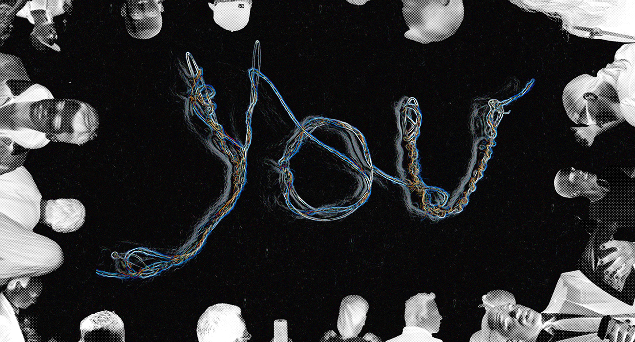
Masthead: To start the process of designing, I used my header of “You” (selected from my body test) and started to create some mastheads for the zine. I started with physically designing using a variety of materials and mediums ranging from ink to guitar string and twine. This process then led me to digitally manipulating the creations and seeing what could be exaggerated, highlighted, or modified.
Imagery: After an experiment with mastheads, I then started to incorporate imagery along some the typographic play. Some of the images were sourced online and some of them were created by me however all had a similar style to them - a cryptic cyber aesthetic.
Layout: Using the imagery and mastheads together gave a sense for the cover however I still needed to play with the layouts and spreads for within the zine. The next stages were creating a variety of layouts and coming up with different styles along the way. This included imager, placeholder body text and any other assets.
Text Alignment: Based off the same layout, I wanted to refine the text layout, and such used the same body text but took more care in line length, tracking, kerning, leading, widows, and orphans. Along with the basic terms I tried a varying number of columns to see what best fit each set up.
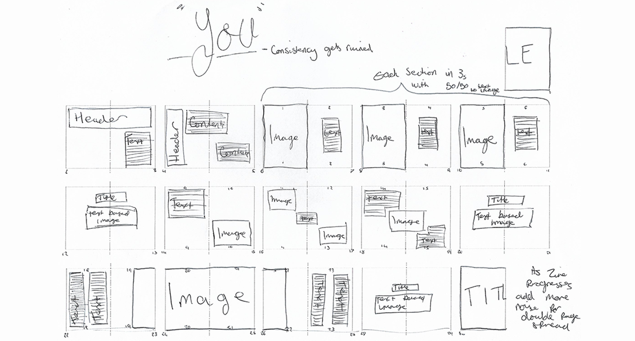
Flatplans: Once all the ideas and iterations were completed, I then designed a few different flat plans to help express the flow and narrative of my zine. I designed a consistent plan where there was a rule of 3 applied to the 3 upcoming double page spreads, a chaotic plan where every spread dwelled on the line of legibility and sense and finally a plan to represent tidiness and organised content with streamline columns, nothing jarring or out of place.
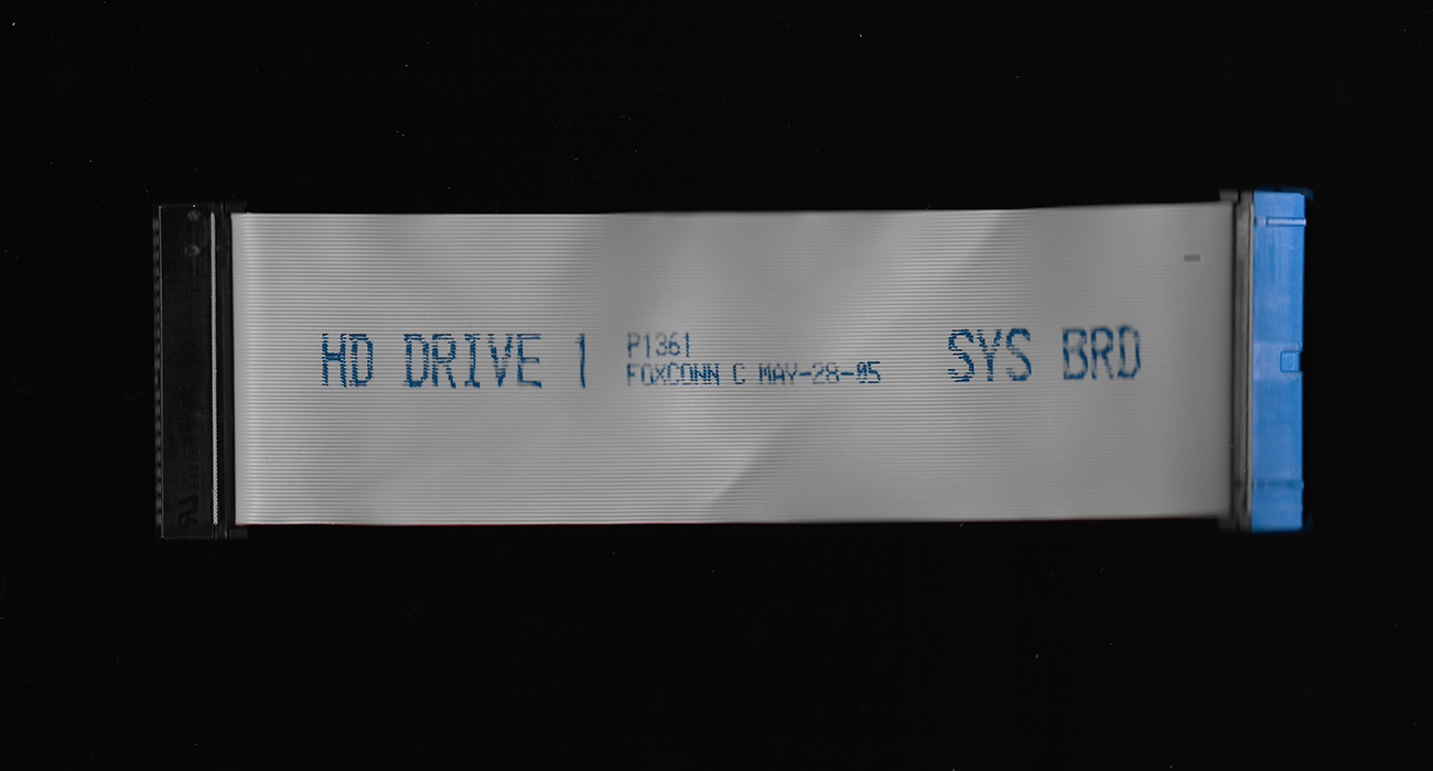
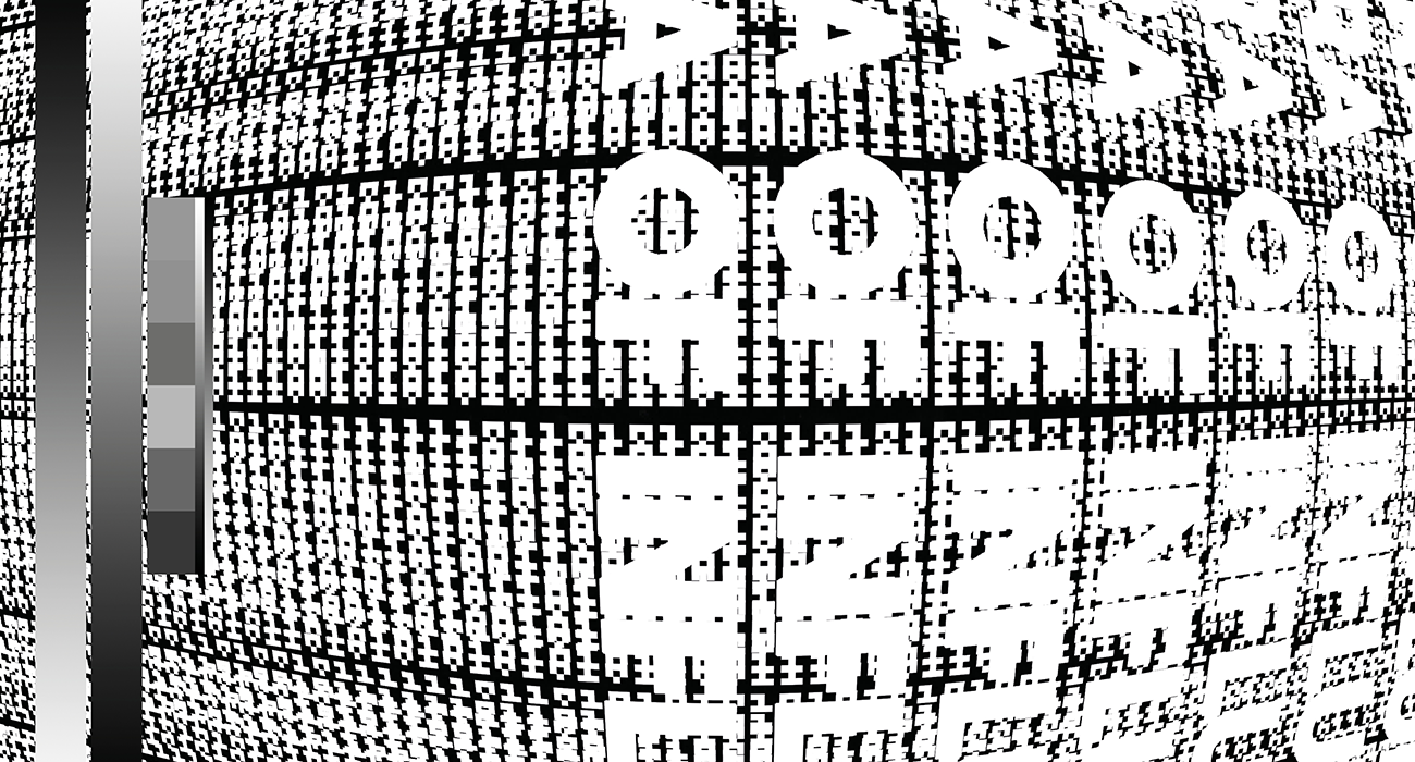
Asset Creation: After deciding on a flat plan, it was time to start collecting content and assets for the zine. For my imagery I wanted to keep to the cyber theme and used a scanner to capture many different computer parts I had laying around. The assets were made using a coded pixel art program and created a variety of images relating to cyber security.
OUTCOME
The finished zine was a great expression of pixelated imagery, security, and cyber text. I was super happy with the outcome of my zine and proud of the creative process I undertook to achieve it. Normally this isn’t the creative route id go to create something, or I’d have more restrictions on a project but being able to freely express my intentions and explore new aesthetic avenues was highly rewarding.
Download the full zine here!